
Chipper Cash
Design Lead
Design Systems, Branding
⎯
Chipper Cash is one of the largest mobile cross-border money transfer platforms in Africa. Its goal is to let users send and receive money "fast, free and easy", we were very recently featured in Forbes.
At Chipper, the early iterations of our app were not consistent for a few reasons:
• We prioritized speed of shipping over consistent design
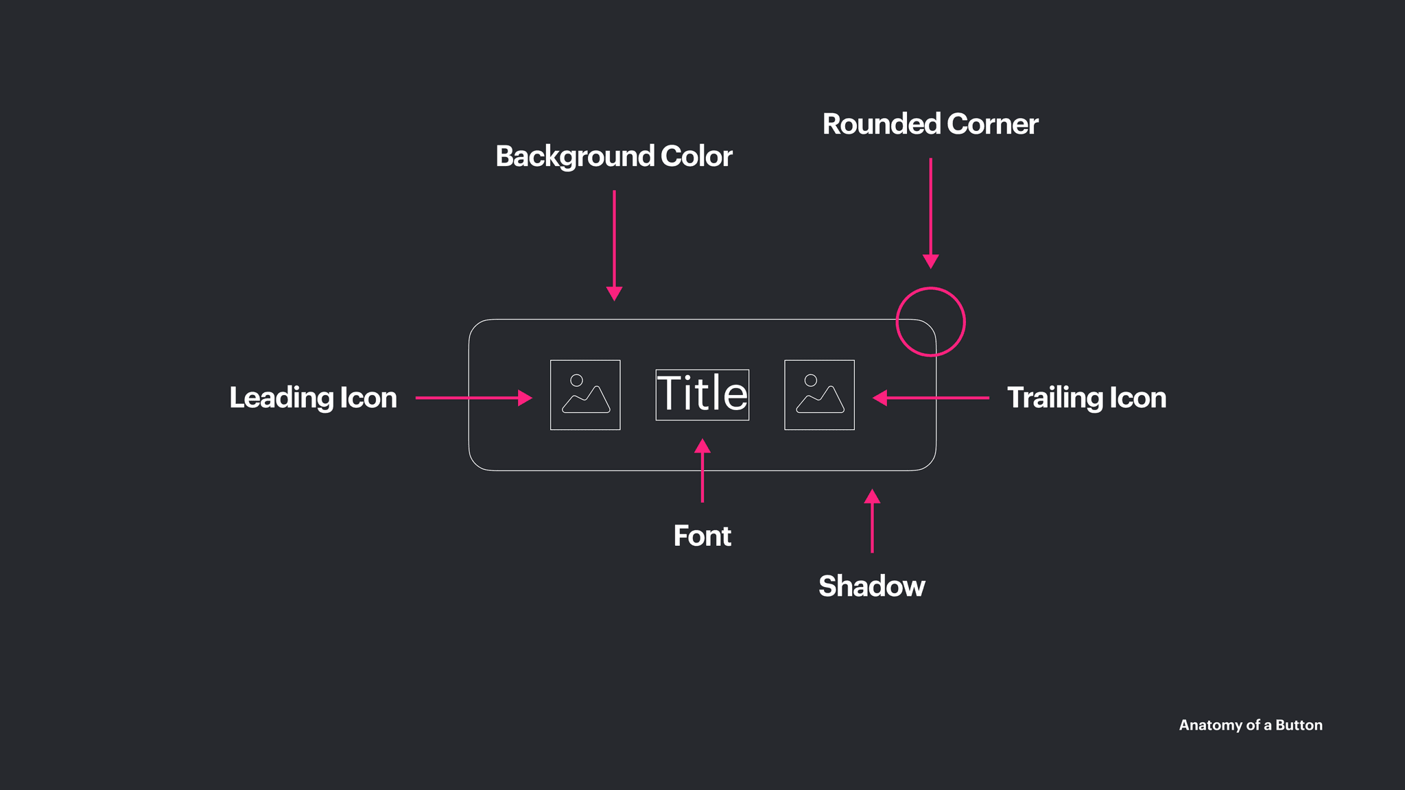
• We did not take the time to design scalable components that were able to convey the Chipper Brand, and match our users' expectation for the platform they're using
So we set out to create a framework for consistency across Chipper products with the goal of establishing trust with our users.
The process has been long, and we've got an even longer way to go but we started by taking inventory of the current mobile design.

Along the way, we had to demonstrate to the organization why we needed a system. We also had to establish new processes for designing, reviewing, and shipping UI.

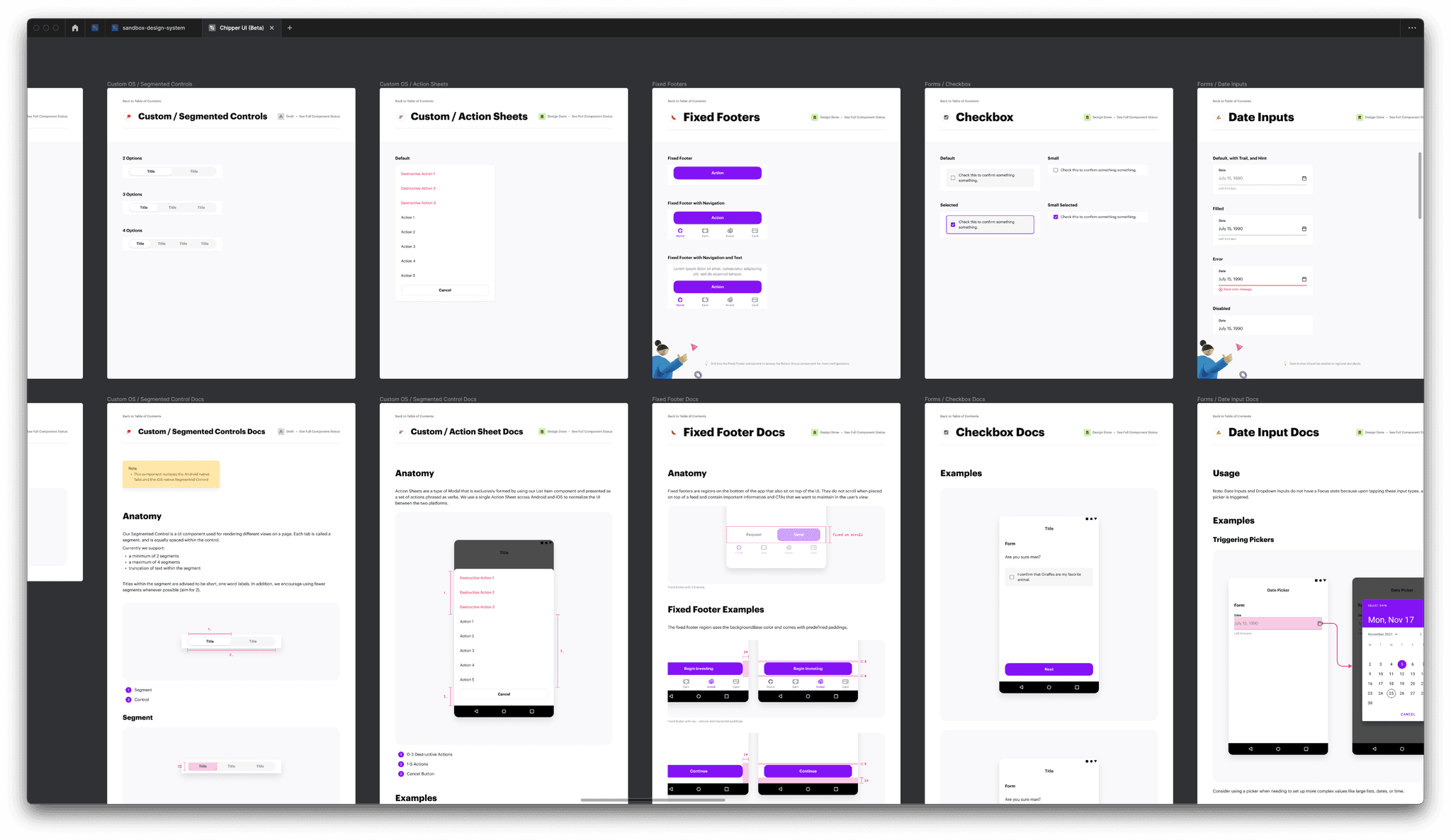
The earliest Alpha versions of Chipper UI were reflections of our first designs, back when we had a 4 person design team. We took inventory of everything including navigation patterns throughout the app and continue to do so today (ignore the mess 😩). We've now grown to a 12 person design team and have began scaling our system to web!


Even our first baseline set of components had many iterations before releasing a Beta version of Chipper UI 1.0. For simplicity, we documented all the work along the way inside Figma itself in a giant single-page file alongside our Stickersheets (we'll soon evolve this part of our process). Below are the latest iterations of our systemized UI. 🎉


Chipper Cash
Design Lead
Design Systems, Branding
⎯
Chipper Cash is one of the largest mobile cross-border money transfer platforms in Africa. Its goal is to let users send and receive money "fast, free and easy", we were very recently featured in Forbes.
At Chipper, the early iterations of our app were not consistent for a few reasons:
• We prioritized speed of shipping over consistent design
• We did not take the time to design scalable components that were able to convey the Chipper Brand, and match our users' expectation for the platform they're using
So we set out to create a framework for consistency across Chipper products with the goal of establishing trust with our users.
The process has been long, and we've got an even longer way to go but we started by taking inventory of the current mobile design.
Along the way, we had to demonstrate to the organization why we needed a system. We also had to establish new processes for designing, reviewing, and shipping UI.
The earliest Alpha versions of Chipper UI were reflections of our first designs, back when we had a 4 person design team. We took inventory of everything including navigation patterns throughout the app and continue to do so today (ignore the mess 😩). We've now grown to a 12 person design team and have began scaling our system to web!
Even our first baseline set of components had many iterations before releasing a Beta version of Chipper UI 1.0. For simplicity, we documented all the work along the way inside Figma itself in a giant single-page file alongside our Stickersheets (we'll soon evolve this part of our process). Below are the latest iterations of our systemized UI. 🎉